Maison Noir ( 法文:黑房子 )
- 因著黑房子的存在,得以見著曙光 -
光線 從外圍的黑色間隙 透出
夢想 從尋常邊緣的切角 而上
延伸出一座博物館
退居在你之後 日日出展
蟄伏是為了奮力躍起
黑暗是為了顯露光亮
白牆是為了鏡前妳一身新衣 綻放
這藝廊 今日特展 青春糖霜
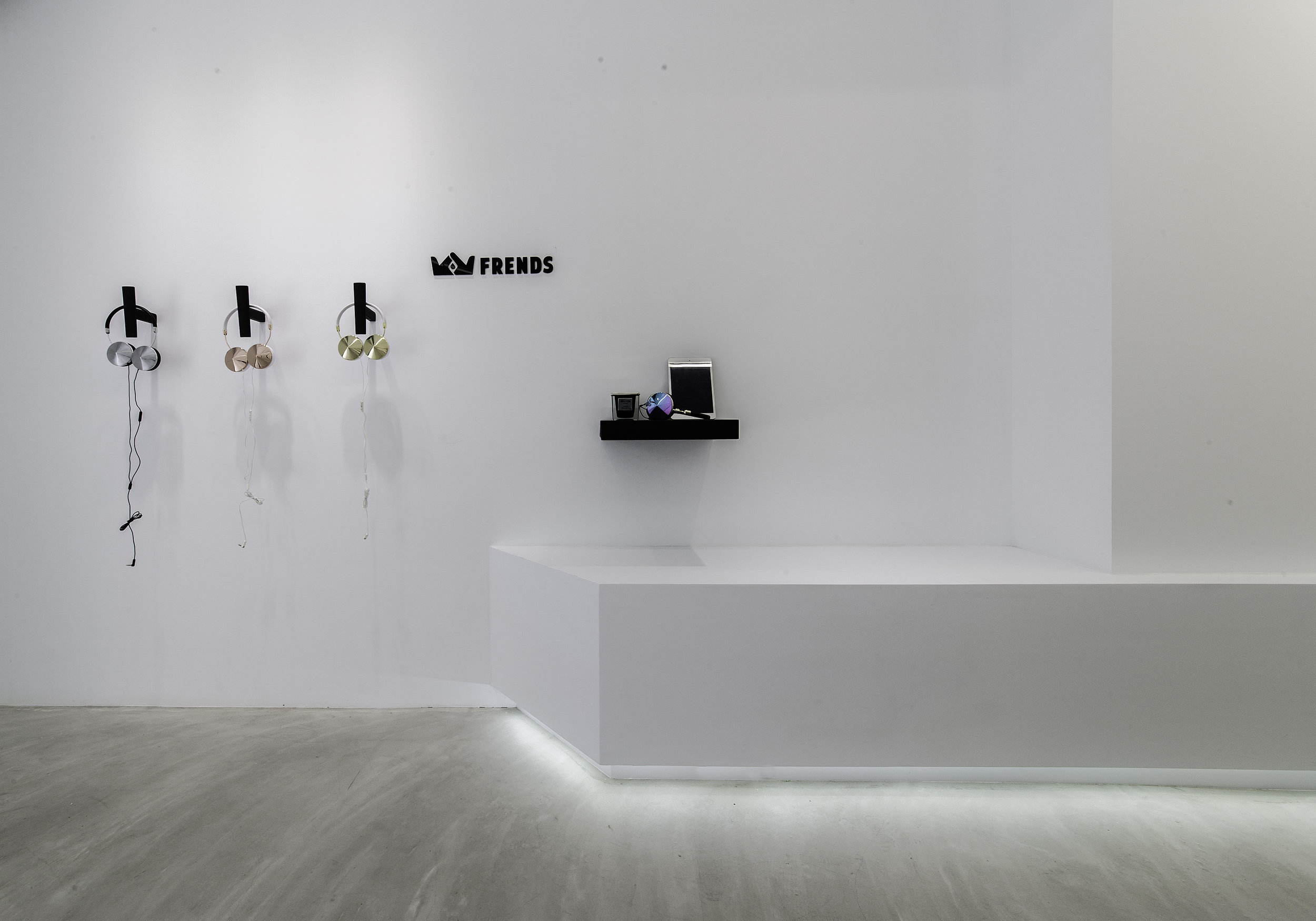
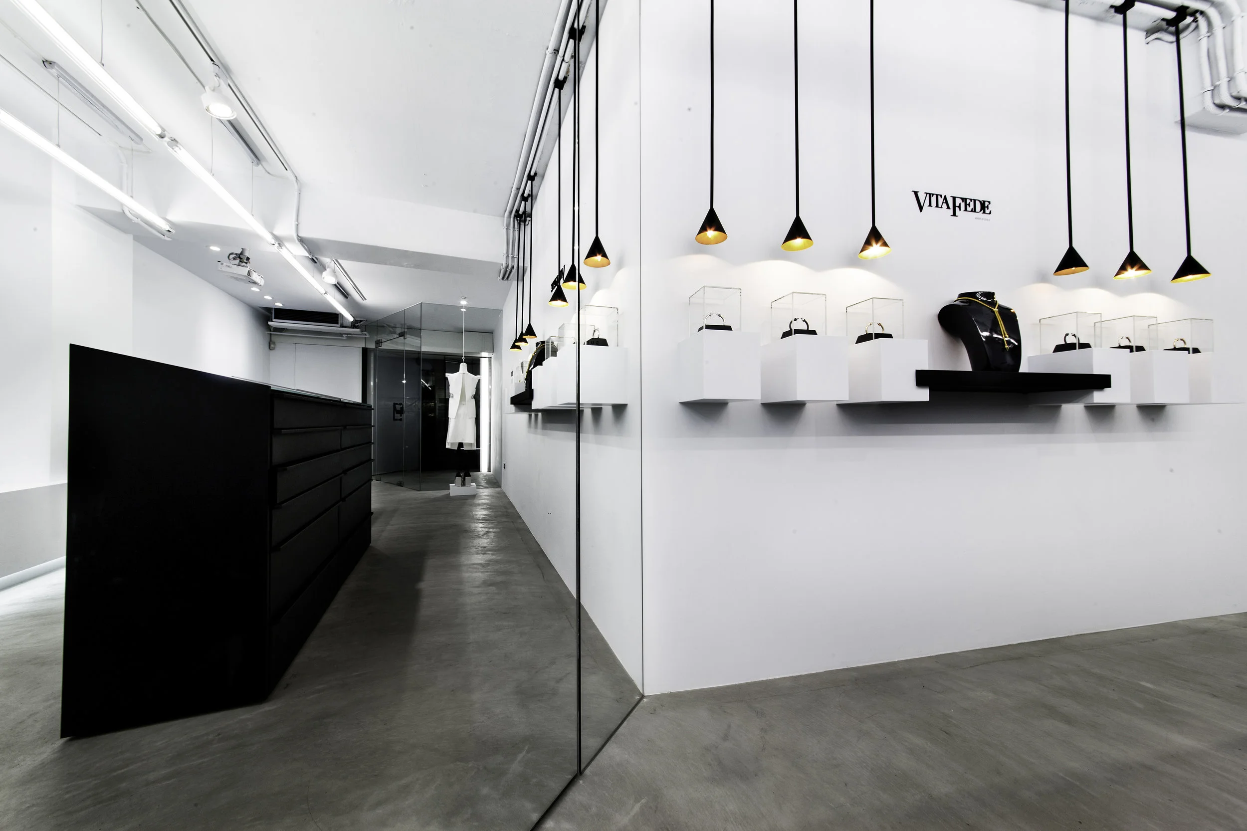
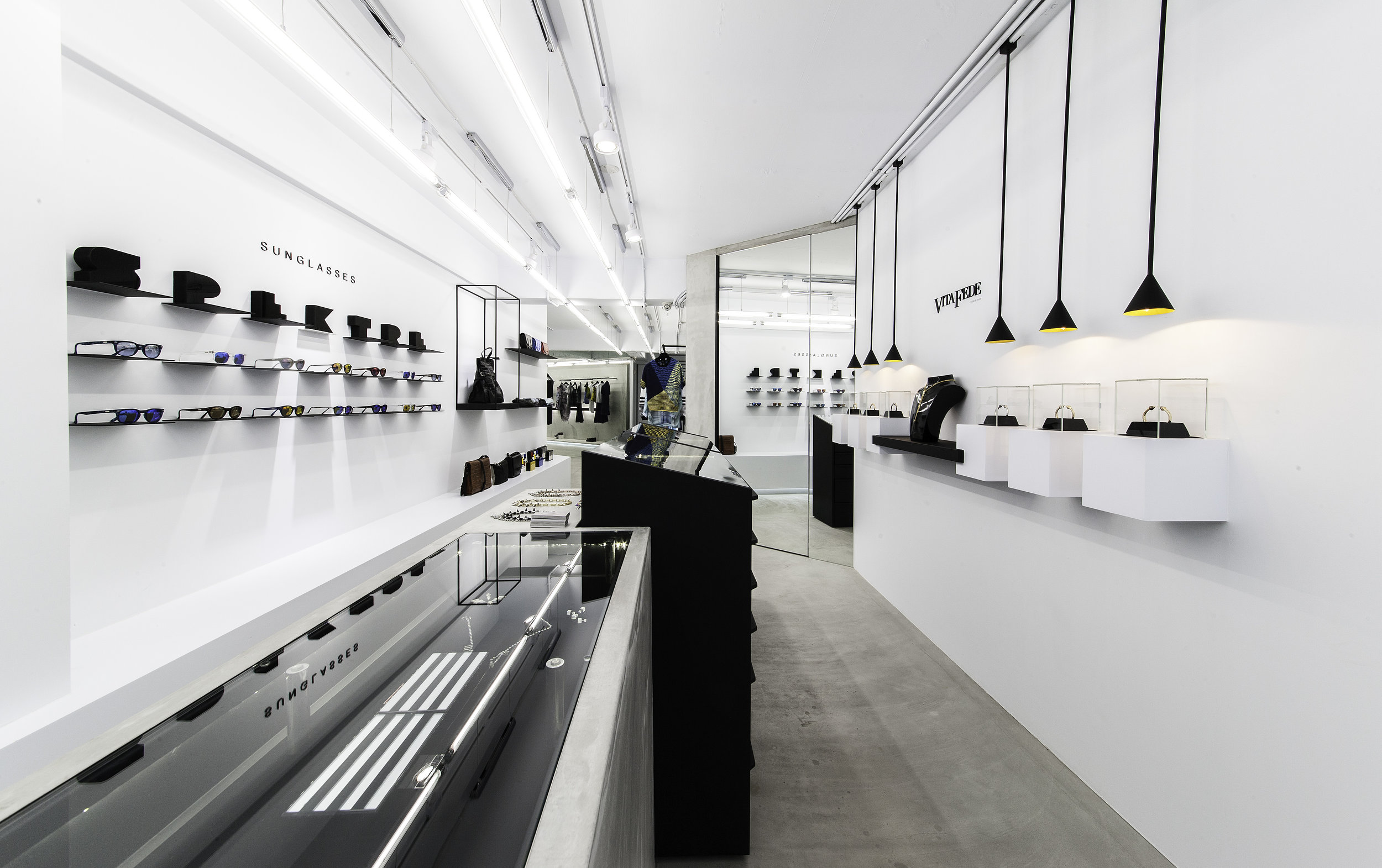
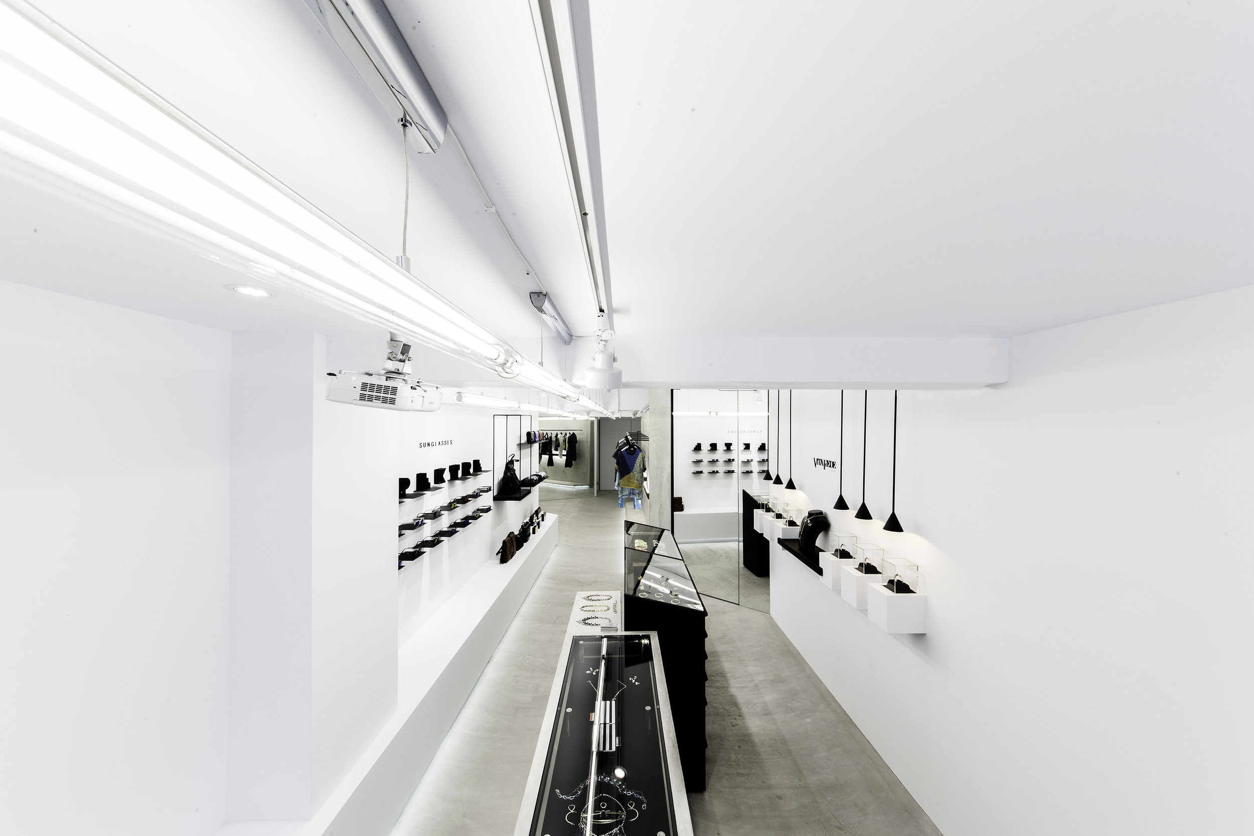
以黑導引光的存在,將空間的純粹最大化,創造一個純白殿堂讓商品猶如藝術品般存在並展示。狹長的空間運用轉折鏡面,切割出多個不存在的空間,讓窄小坪數轉換更多饒富趣味的空間視覺感。
冷冽黑鐵材質在入口處「轉折、覆蓋」形成大面量體,東區街道的喧鬧在此瞬間沉靜,微小清透的玻璃入口,引導光線沿著縫隙流動,對比外觀的硬黑沈靜,烘托出「因著黑房子的存在,得以見著曙光」的設計理念。
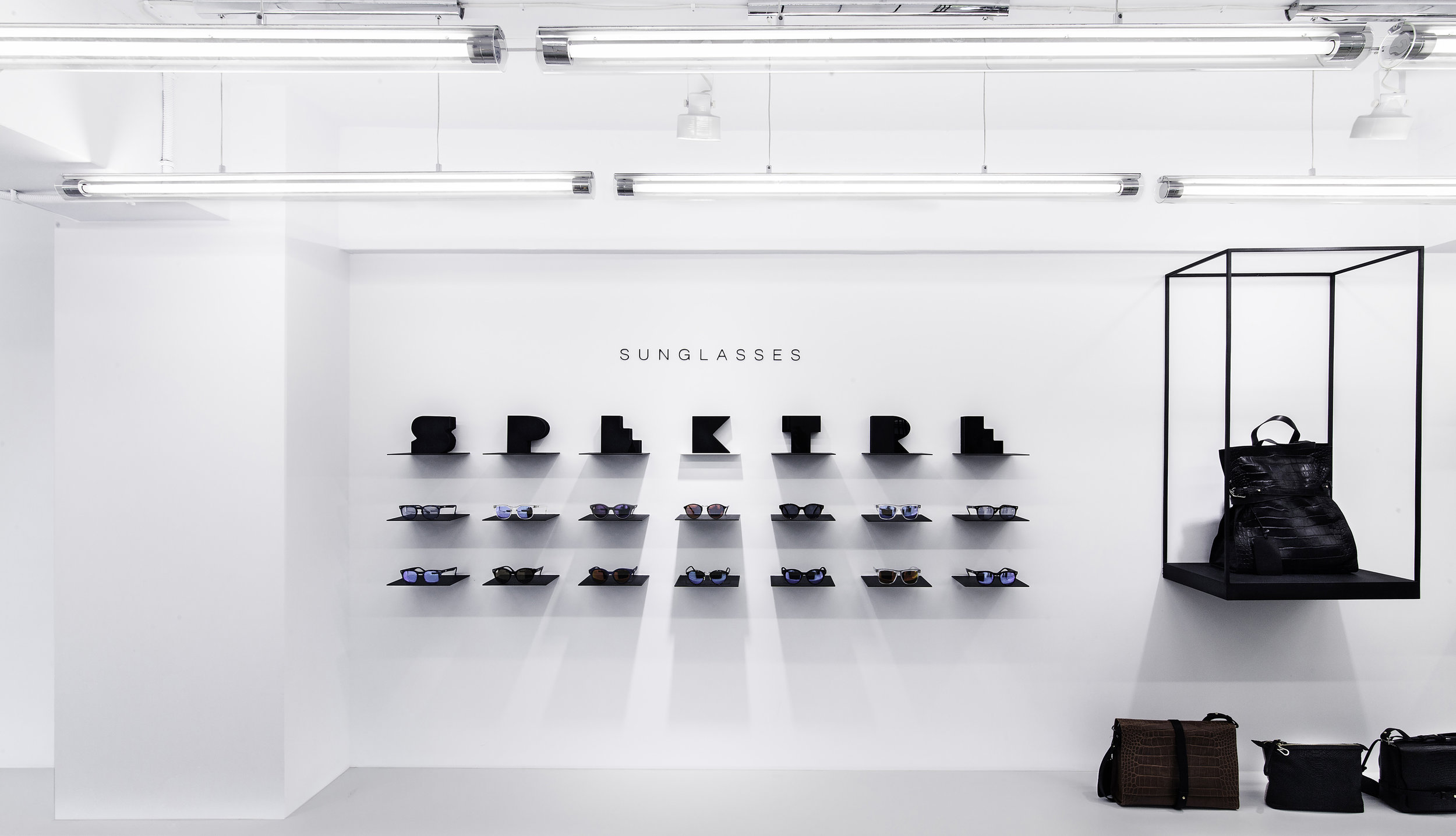
室內的展示空間,專注於減法的設計原則,運用展台和燈飾突顯商品,隱藏多餘的細節,策展方向是簡約、純粹、專注地將物件如藝術品般呈現,黑房子同時也兼具了時尚的藝術殿堂。
色彩設計上,黑白灰冷調質感貫穿,綴以鍍鈦金的極細線條,營造出時髦俐落形象。抬頭可見天花上長型的白色燈飾,那是光感指標,帶領人們的目光引向室內。由於店面屬狹窄型的構造,設計上以斜切角度靈活帶出鏡面的折射,完美轉換坪數侷限,創造出曖昧有趣的視覺想像空間。展示櫃體下緣也運用隱藏光,讓沈重的量體在空間裡懸浮輕盈了起來。整體視覺從門面的黑進入室內的光,猶如步行來到隧道出口,我們在曲折空間中找出時尚和藝術的無限可能性。
Main Subject:Living with the black house lets you see the beauty of light.
Design Concept:By guiding the existence of light with dark, we maximize the pureness of the space and create a hall of clean white to show each product as if it were an art display. The hallway-like interior design uses the magic of mirror reflection and perfectly transforms the small space into a place of wonder and imagination.
We use mass amount of black, cold metal material that twines and covers the entrance, and it successfully isolates the noise of the busy city. The little glass entrance guides the light within the gaps, and with the contrast compared to the black outlook, it shows the designing concept of “light can be so much more beautiful with a black house”.
The interior design emphasizes on subtraction design, using the showcases and spotlights to let the products’ feature stand out and hide away the various details. Our goal is to make products be seen in a simple, pure and concentrated fashion as if showing delicate artworks, and transform the black house into a palace of art.
On the colors, we use black, grey and white for a cooler color tone, and decorate it with titanium lines, giving the place a fashion-clean look. On the ceilings we use long white lights as lighting guides that guide the attention of customers deep into our store. The hallway-like interior design uses the oblique cut of the mirror and perfectly transforms the small space into a place of wonder and imagination. Under the showcases there are also hidden lights to create an illusion of light-weighted space. The whole concept is to capture customer’s attention with our house of wonder where they explore endlessly in our space of infinite possibilities for art and fashion


